
In the previous post Enhancing Business Central with PowerApps – Fredborg we looked at how we could connect Business Central to Dataverse, and what kind of Power Apps are available to us.
In this post, we will develop a straightforward Model-Driven app using virtual tables in Dataverse that interface with Microsoft Dynamics 365 Business Central. This app will be based on a custom module I’ve created in Business Central named “Superhero.” For those interested in the technical details or who wish to follow along, the source code for this project is available on my GitHub page. The Superhero module includes several components: tables for superheroes, superhero lines, weapons, and superpowers, as well as the API pages necessary to interact with these tables.
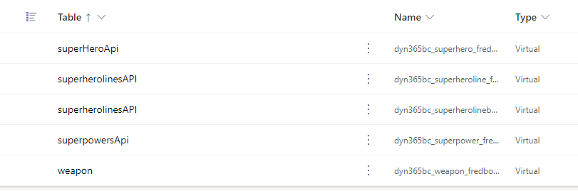
The first step in our project is to navigate to make.powerapps.com. Once there, click on “Tables” and search for the table named “Available Business Central Table.”

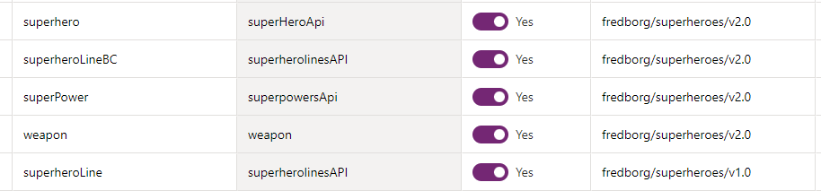
In this table, you will need to mark the following tables as visible: superhero, superheroLineBC, superPower, and weapon. Making these tables visible allows them to be accessed within Dataverse.
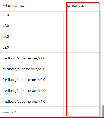
A useful tip is to also make the “Refresh” column visible. This field is particularly important because it is used to force Dataverse to fetch the latest updates from your Business Central API pages.
Once you have made the relevant tables visible in Dataverse, you can check to see the data directly from Business Central.
Navigate to the superheroLines table in Dataverse to view this data. To examine how your tables are related, click on the “Relationships” button. This displays the relationships between your tables.
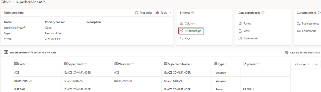
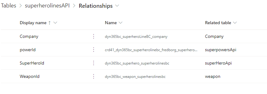
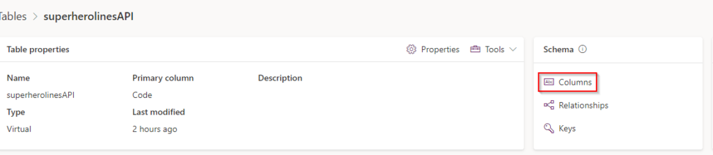
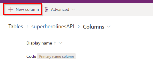
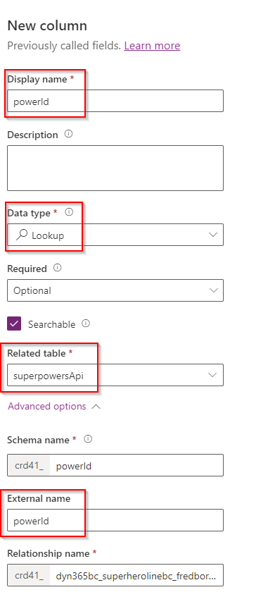
I encountered an issue where the powerId relationship was not appearing as expected. To resolve this, I had to manually create it. Here’s how you can do it: go to “Columns” in the superheroLines table and create a new column named powerId. Set this column as a lookup to the superPower table. This manual step ensures that the necessary relationship is established, allowing for proper data interaction within your app.
Building the App
When constructing a Model-Driven app, there are two main approaches to consider. The first approach involves creating all the views directly within the Power App itself. The second approach, which we will follow, involves doing as much setup work as possible upfront by creating views directly within your Dataverse. This method ensures that whenever someone uses your tables, they are immediately provided with a view that is ready to use. Additionally, this approach helps maintain consistency across all your applications.
To create our views from inside Dataverse, navigate to the superHeroApi table and select “Views.” This allows you to define how data is presented and interacted with across your app, setting a standard view that can be utilized universally.
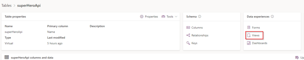
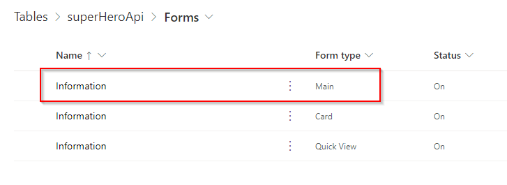
Once you’re in the “Views” section of the superHeroApi table, you’ll see a list of the different standard views available for use. Although you have the option to create a custom view, in this tutorial, we’ll focus on modifying the existing standard views. We’ll start with the one named “All superheroes,” which serves as our primary list view. This view will allow us to display all entries from the superhero table, and we’ll walk through the steps to edit this to better suit our needs.
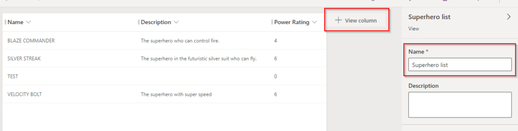
Since we are working with the list view, which is intended for a broader overview, we don’t need to include too much detail. In our case, we will enhance the view by adding only the essential fields: ‘Description’ and ‘Power Rating’. This can be done by clicking the “+ View Column” button and selecting these fields from the list.
Next, to make the view more descriptive and tailored to our specific setup, I will rename the view from “All superheroes” to “Superhero List”. This renaming helps clarify the purpose of the view and ensures it is easily identifiable within the system.
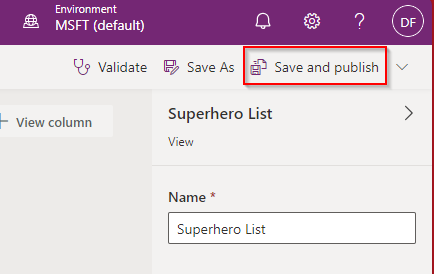
Next press the Save and publish button.
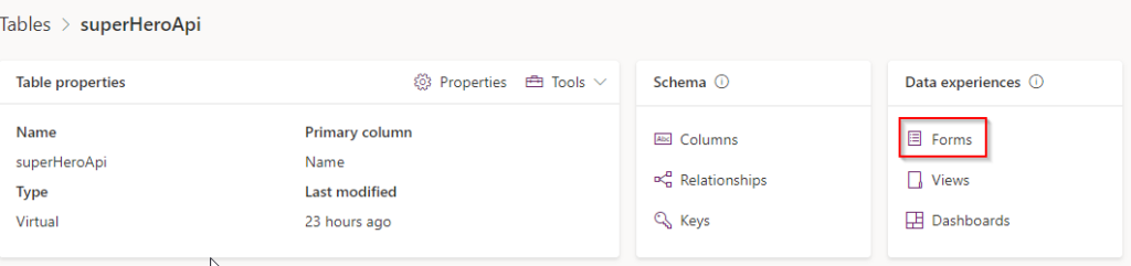
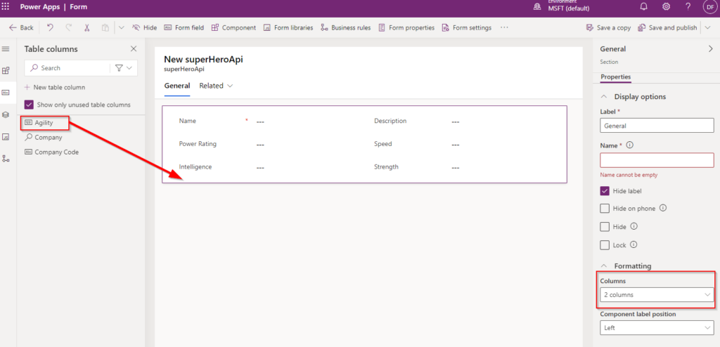
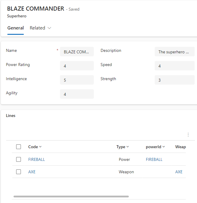
Next, navigate back to your table in Dataverse and select “Forms.” Here, we will focus on editing the main form used for detailed data entry and review. This form is crucial for capturing and displaying the full range of information about each entry in a user-friendly format. Let’s proceed to make the necessary adjustments to this main form to ensure it meets our application’s requirements.
Using the intuitive drag-and-drop interface, you can easily add and arrange the fields you wish to display on the main form. This flexibility allows you to tailor the form exactly to your application’s needs. Additionally, you have the option to configure the layout by choosing the number of columns for each section. This customization helps in organizing the form in a way that enhances usability and ensures that all necessary information is accessible and clearly presented to the users.
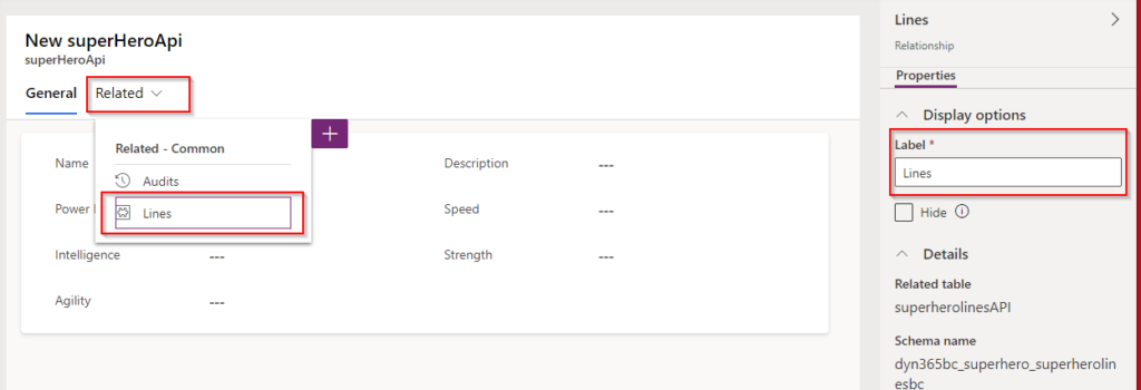
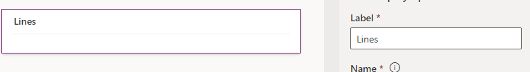
You may observe a section labeled “Related” at the top of the form. This section displays any table relationships linked to your superhero table. For instance, in my setup, there’s a relationship to the superheroLineBC table. To make this clearer and more intuitive for users, I will rename this relationship to “Lines.” This simple renaming helps users quickly understand the nature of the relationship and access the related data more efficiently.
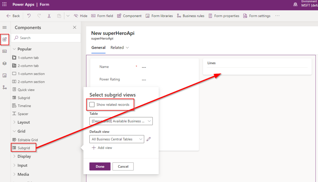
Another effective method to display related tables is by using a subgrid. Here’s how to integrate one into your form:
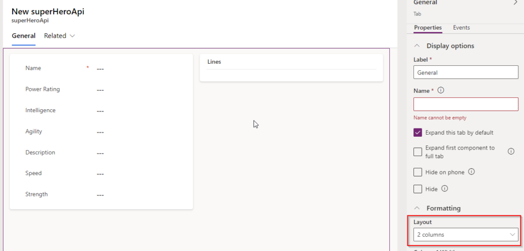
- Adjust the Layout: First, set your form layout to display two columns. This split allows for a clearer and more organized presentation of information.
- Rename the Section: Change the name of the new section where you plan to add the subgrid to “Lines.” This name helps users easily identify what the section contains and relates to.
- Add the Subgrid: Place a subgrid in the newly named “Lines” section. Make sure to configure the subgrid settings to specifically show related records.
- Enable Related Records: Ensure you set a checkmark in the “Show related records” option within the subgrid settings. This setting will link the subgrid directly to your related table, such as
superheroLineBC, displaying all relevant associated data right within the form.
By following these steps, you enhance the form’s functionality and user experience, making it easy for users to navigate and interact with related data efficiently.
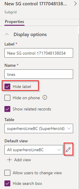
Currently, the subgrid may appear quite basic. To improve its aesthetic and usability, you can start by hiding the label, which helps to clean up the interface for a more streamlined look. Next, focus on customizing which view the subgrid displays:
- Hide the Label: In the subgrid settings, find the option to manage the label and select ‘Hide’. This reduces clutter and draws more focus to the content of the subgrid itself.
- Customize the View: Decide which specific view you want the subgrid to display. You can either create a new view or edit an existing one to better meet your needs. If editing an existing view, navigate to the view settings and make the necessary adjustments to ensure that it showcases the most relevant information in a user-friendly manner.
These modifications will enhance the visual appeal and functionality of the subgrid, making it a more valuable component of your form.
Just like with the “Superhero List” view, you can personalize the subgrid to display the columns that are most relevant to your users. Here’s how to do it:
- Access the View Settings: Navigate to the settings for the view you’ve chosen to display in the subgrid.
- Add Columns: Use the “+ Add Column” button to select and include the fields that you want to appear in the subgrid. This allows you to tailor the displayed information according to the specific needs and priorities of your app.
- Arrange the Columns: After adding the desired columns, you can arrange them in an order that makes the most sense for users to quickly understand and interact with the data.
By customizing the columns in the subgrid, you ensure that the view is not only informative but also aligned with the overall design and functionality goals of your app.
To maintain a cohesive and efficient user experience across your Model-Driven app, it’s important to apply similar customizations to all tables involved. Here’s how to do it:
- Review Each Table: Go through each table in your Dataverse setup, such as
superheroLineBC,superPower, andweapon. - Customize Views: For each table, adjust the views to ensure they display the most relevant columns and data. This might involve adding new columns, reordering existing ones, or even removing unnecessary columns.
- Modify Forms: Similarly, tailor the forms for each table by adding or rearranging fields, and adjusting layouts to meet your specific requirements. Ensure that each form facilitates an intuitive and productive interaction for the users.
- Ensure Consistency: As you customize each table, keep an eye on maintaining a consistent look and feel throughout the app. This includes similar naming conventions, layout structures, and interaction patterns.
By methodically customizing the views and forms for all your tables, you not only enhance the individual functionality of each component but also ensure a seamless and harmonious user experience across your entire Model-Driven app.
Once you have configured all the necessary views and forms for your tables, the next step is to build the Power App itself. Here’s how you can get started:
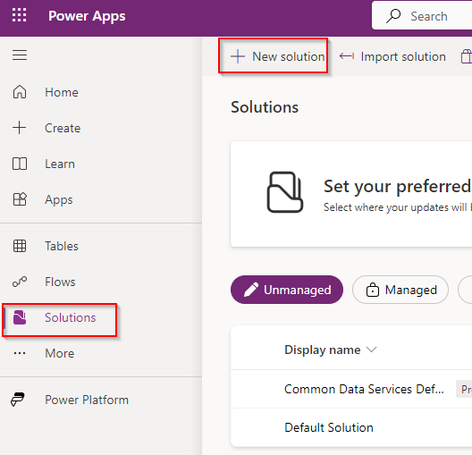
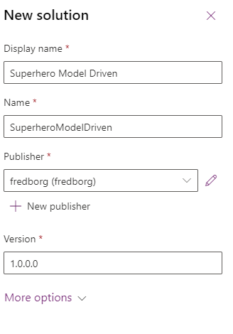
Before diving into app development, it’s important to organize your components in a structured way. The first step is to create a new solution:
- Navigate to Solutions: Go to the “Solutions” tab within your PowerApps environment.
- Create a New Solution: Click on the “New Solution” button. This action will prompt you to provide details for your new solution, such as its name, publisher, and version. Fill in these fields to define the context and ownership of the components you will develop.
Creating a solution is a critical step as it helps manage and package your app’s entities, forms, views, and other components together, making deployment and maintenance easier across different environments.
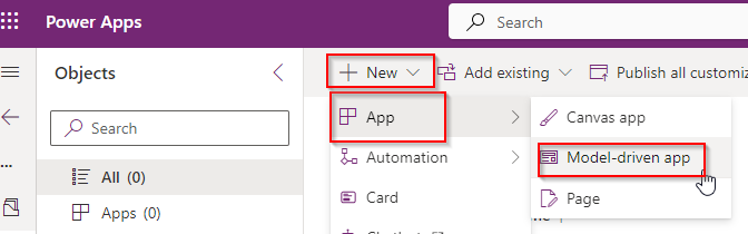
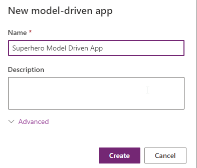
After initiating the creation of your Model-driven app:
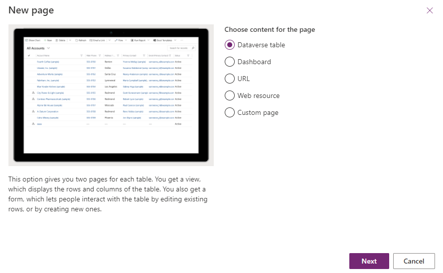
- Add New Pages: Click on the “New Page” action to start adding pages that will define the core areas of your app.
- Select Dataverse Table Option: When prompted to choose the type of page, select “Dataverse table.” This option is designed to directly integrate and display tables from Dataverse.
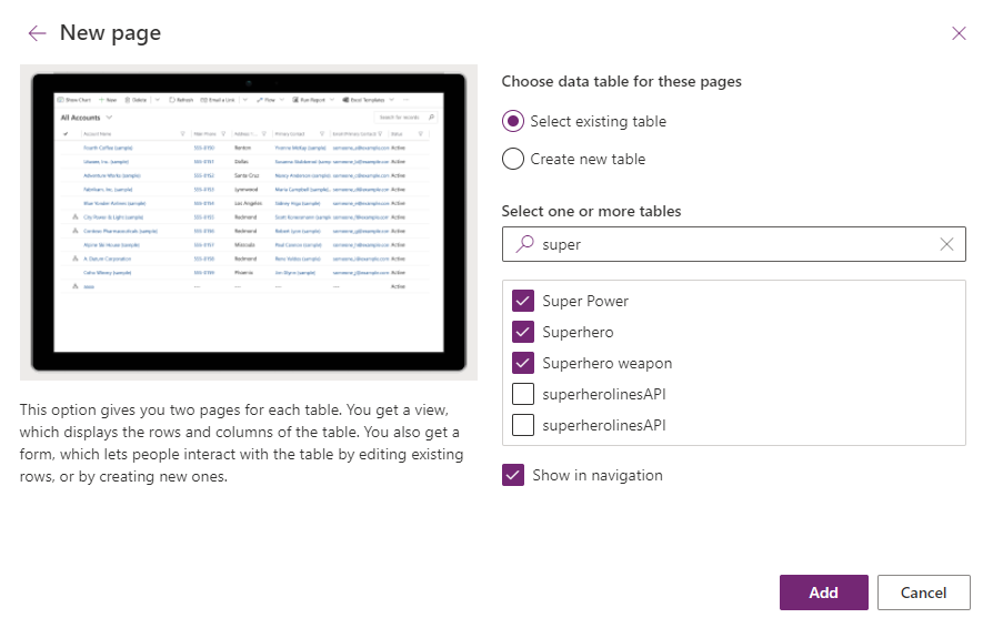
- Choose Tables: From the list of available tables, select the “Superhero,” “Super Power,” and “Superhero Weapon” tables. Each of these selections will create a new page in your app that is dedicated to one of the tables, enabling specific functionalities and views related to each aspect of your superhero module.
By following these steps, you effectively lay out the foundational pages of your app, ensuring that each key component of the superhero data is accessible and interactively managed through the app.
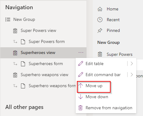
Once you’ve added the tables to your Model-driven app, you’ll notice that they automatically appear in the app’s navigation menu. This default behavior occurs because the “Show in Navigation” option was left checked during the table selection process.
Reordering the Navigation Menu:
- To prioritize how your data is displayed, you may want to adjust the order of the tables in the navigation menu. For example, if you want the ‘Superheroes’ table to appear at the top, simply use the “Move Up” action available in the navigation menu settings. Continue this action until the ‘Superheroes’ table is positioned as desired.
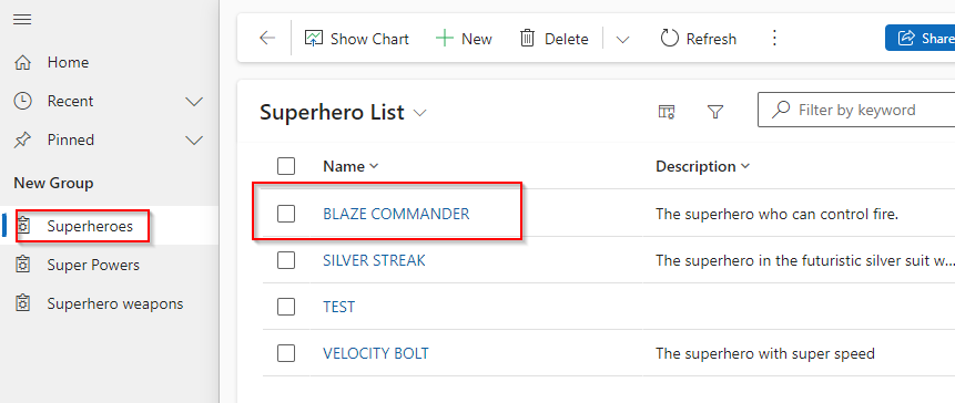
Checking the Displayed Views and Forms:
- You’ll see that the view displayed in the app corresponds to the one you set up earlier within the Dataverse table. This ensures consistency and familiarity for users who navigate through the app.
- Additionally, when accessing the main form of the ‘Superhero’ table, it should reflect the customization you applied earlier. The form layout, fields, and overall design will match the configurations you established, reinforcing a tailored user experience.
Finalizing Your Model-driven App:
- At this point, your Model-driven app is effectively utilizing the virtual tables from Business Central. With the tables added to your navigation menu and the customized views and forms in place, your app is now ready for further testing and eventual deployment.
This setup demonstrates how seamlessly Dynamics 365 Business Central integrates with Power Apps, leveraging Dataverse to enhance and extend its capabilities through customized applications.
Conclusion
Throughout this post, we’ve explored the integration of custom API pages from Microsoft Dynamics 365 Business Central into Dataverse, demonstrating a streamlined approach to app development. By pre-defining our views and forms directly within Business Central, we’ve laid the groundwork for rapidly creating a Model-Driven app. This method exemplifies the simplicity and power of Model-Driven apps—most of the heavy lifting is done upfront, enabling the creation of a functional app with minimal additional effort.
While today’s tutorial only scratches the surface of what’s possible with Model-Driven apps, it serves as a practical starting point for delving deeper into the capabilities of Power Apps. There’s much more to explore and customize, and this guide should empower you to embark on your journey into the expansive universe of Power Apps with confidence.
By following these steps, you’ve seen firsthand how efficiently and effectively you can harness the integration between Business Central and Power Apps to enhance business processes and improve operational efficiency. Whether you’re a seasoned developer or new to the platform, the tools and techniques discussed here can significantly contribute to your digital transformation initiatives.