
In our previous post, we delved into creating a simple Model-Driven app utilizing data from Microsoft Dynamics 365 Business Central within Dataverse. Continuing our exploration of the Power Apps platform, this post will introduce the creation of a Canvas app. The fundamental difference between Canvas and Model-Driven apps lies in their data source flexibility. While Model-Driven apps are confined to data within Dataverse, Canvas apps can integrate with a much wider range of data sources, including Dataverse and external APIs.
Canvas Apps: Enhanced Flexibility and Integration
Canvas apps offer unparalleled flexibility, allowing developers to build highly customized interfaces and interact with data from virtually any source. In this tutorial, we will start by using Dataverse as our initial data source for the Canvas app, similar to our Model-Driven app. However, we will extend our app’s functionality by incorporating direct API calls to Business Central. This approach demonstrates the robustness of Canvas apps in integrating diverse data inputs.
Important Considerations for API Integration
It’s important to note that connecting directly to Business Central via API requires an app registration. While I won’t cover the app registration process in this post, you can refer to one of my previous posts for detailed instructions on setting this up: Become a Business Central API Superhero – Fredborg.
This blog will guide you through the initial steps of creating a Canvas app, highlighting the integration capabilities that distinguish it from Model-Driven apps and showcasing how to harness Business Central data effectively.
Starting Your Canvas App
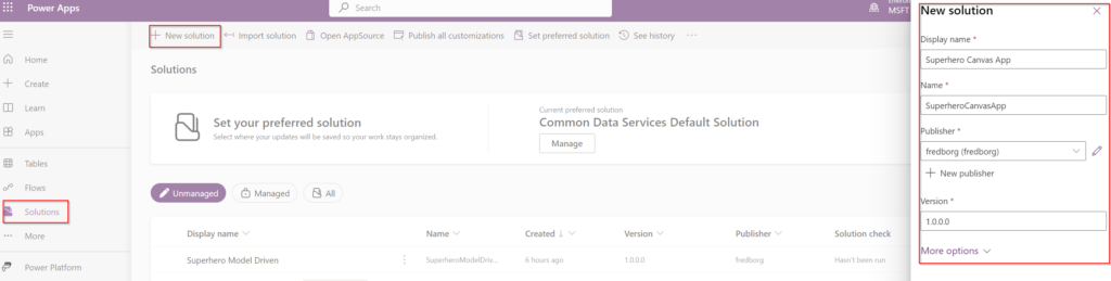
Once you have successfully created your solution, you are ready to begin building your Canvas app. Here’s how to initiate the process:
- Navigate to Your Solution: Open the solution where you want to add the Canvas app.
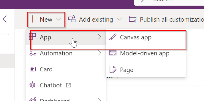
- Create a New Canvas App: Click the “New” button located at the top of the page. From the dropdown options, select “Canvas app.” This action will prompt you to choose between creating a tablet or phone layout, allowing you to tailor the app’s design to the intended user device.
By following these steps, you’ll set the foundation for your Canvas app, which you can then customize and extend with various data sources, including Business Central.
Choosing the Layout: Tablet Mode
For this tutorial, we’ll develop our Canvas app in tablet mode. This choice highlights a key difference between Canvas apps and Model-Driven apps. Model-Driven apps are inherently designed to adapt to multiple screens right out of the box, accommodating various devices and screen sizes with less manual input from the developer.
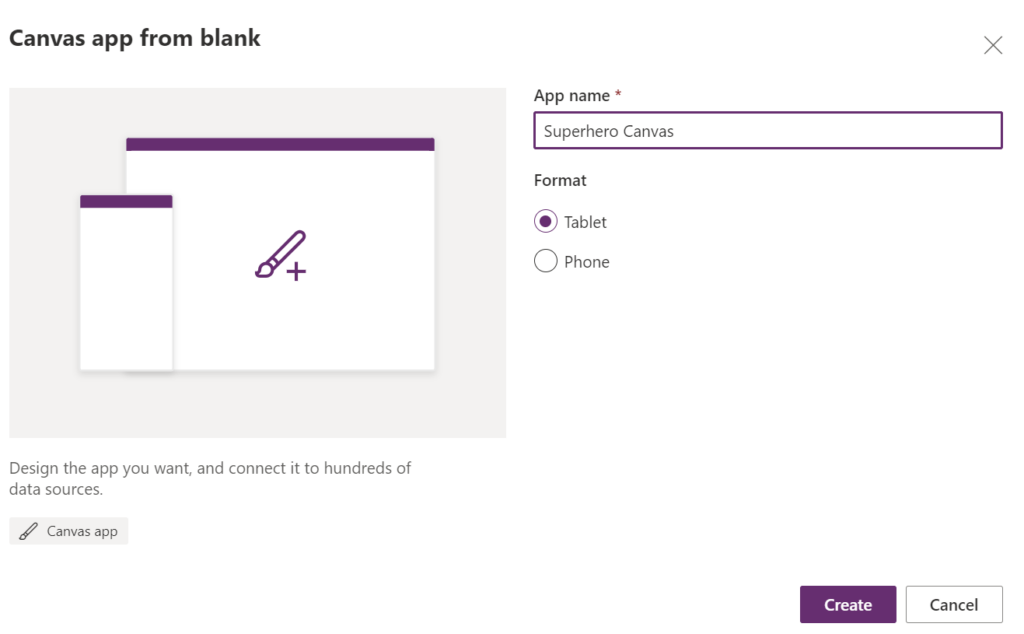
Design Flexibility and Considerations in Canvas Apps
In contrast, Canvas apps offer more design flexibility but require more attention to screen resolutions during the development process. Here are some important considerations:
- Resolution Handling: Unlike Model-Driven apps, Canvas apps do not automatically adjust to different screen sizes. You must design with various device resolutions in mind from the start.
- Reactive Design: It’s crucial to incorporate reactive design principles. This means designing your app so that its layout and elements dynamically adjust according to the screen size on which it is displayed. Implementing a reactive design can help ensure a seamless user experience across different devices, from tablets to phones to desktops.
Design Phase Importance
Given these considerations, it’s essential to factor in resolution handling and reactive design early in the design phase of your Canvas app. This proactive approach ensures that the app not only meets your functional requirements but also delivers a robust user experience across all target devices.
By understanding and addressing these design challenges, you can leverage the full potential of Canvas apps to create tailored, responsive solutions that effectively utilize Business Central data.
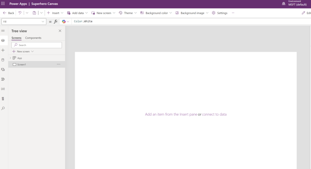
Starting from Scratch: The Canvas Approach
Upon creating your Canvas app, you’re presented with a completely blank canvas and a single screen. This setup starkly contrasts with the Model-Driven app approach, where the app structure is partially defined by the data source and automatically incorporates associated views and forms.
Key Differences Highlighted:
- Initial Setup: In a Canvas app, the initial state is a bare canvas, offering complete creative freedom but requiring you to build everything from the ground up. This includes adding and configuring all screens, components, and data connections manually.
- Data Integration: Unlike Model-Driven apps, where selecting a data source automatically populates the app with pre-configured tables, views, and forms, Canvas apps require you to manually establish these connections and design the layout. You decide how data is displayed and interacted with, starting with a blank slate.
Designing Your App:
This approach underscores the need for careful planning during your design phase. You must strategically consider how each part of your app will function and how different elements will interact. This means designing not only the user interface but also setting up data integrations and workflows from scratch.
While this might seem daunting at first, it offers unparalleled flexibility in app development, allowing you to tailor every aspect of your application to meet specific user needs and business requirements. This level of customization is what makes Canvas apps a powerful tool in the PowerApps suite.
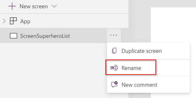
Renaming Your Initial Screen for Clarity
To start organizing your Canvas app effectively, renaming the default screen is a good first step. Here’s how to rename Screen1 to ScreenSuperheroList:
- Locate the Screen: In the left-hand panel where your screens are listed, find
Screen1. - Access Options: Click on the three dots (ellipsis) next to the screen name.
- Rename the Screen: Select “Rename” from the dropdown menu and type
ScreenSuperheroListas the new name.
Renaming the screen to ScreenSuperheroList immediately makes it clearer what the purpose of this screen is within your app. This is especially useful as your app develops and more screens are added, helping maintain a logical flow and organization.
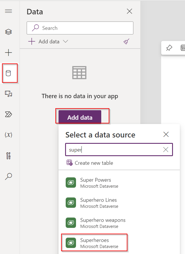
Adding Data to Your Canvas App
Integrating data into your Canvas app is essential for functionality. Let’s start by connecting to the Superheroes table:
- Access Data Options:
- Locate and click the “Data” icon on the left-hand side of the screen or in the menu bar, depending on your setup. This icon typically resembles a database or table symbol.
- Add Data Source:
- Click on “Add data” to open the data panel. This allows you to connect to various data sources.
- Select Your Data Table:
- Browse through the list of available data sources or use the search function to find the ‘Superheroes’ table. Once found, select it to add it as a data source for your app.
By adding the Superheroes table, you’ve now linked your app to a specific set of data in Business Central. This table will serve as a backbone for the app’s functionality, allowing you to create interactive elements based on the superhero data.
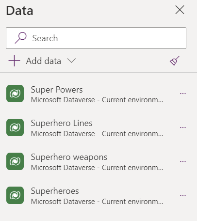
Adding Additional Tables to Your Canvas App
To ensure your app has access to all necessary data, follow these steps to add the remaining tables:
- Repeat the Data Addition Process:
- Navigate back to the “Data” icon and click on “Add data” again.
- Add Each Table:
- One by one, locate and select each table—
Superhero Lines,Super Powers, andSuperhero Weapons—from the list of available data sources. If you have many tables, use the search bar to quickly find each one.
- One by one, locate and select each table—
- Confirm the Additions:
- After selecting a table, ensure it’s added to your app’s data sources. Repeat this process until all relevant tables are added.
By adding the tables Superheroes, Superhero Lines, Super Powers, and Superhero Weapons, you’ve equipped your app with a rich set of data. This broad data integration will allow you to build more detailed features and interactions, such as linking related data points and creating comprehensive views that leverage multiple tables.
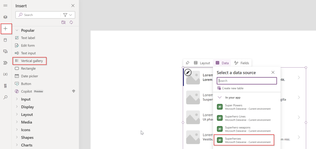
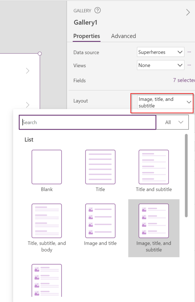
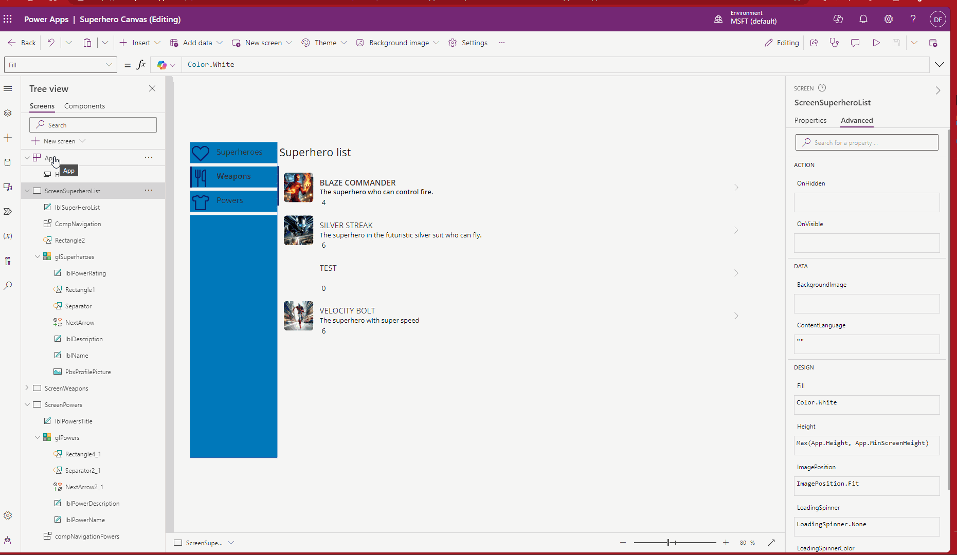
Adding a Vertical Gallery to Display Superheroes
- Navigate to Components:
- Click on the “Insert” tab located in the top menu. Under this tab, you’ll find various UI components and controls. Look for the “Gallery” option—it might be directly visible or nested under a menu like “Layout”.
- Choose the Vertical Gallery:
- Click on “Vertical” under the Gallery options. This action will activate the gallery tool.
- Add the Gallery to Your Screen:
- Click and drag the Vertical Gallery onto
ScreenSuperheroList. Position it according to where you want it on the screen.
- Click and drag the Vertical Gallery onto
- Set the Data Source:
- Once the gallery is placed on the screen, a configuration pane will appear. Here, you can set the data source for the gallery. Select the
Superheroestable as the source. This will automatically populate the gallery with data from theSuperheroestable.
- Once the gallery is placed on the screen, a configuration pane will appear. Here, you can set the data source for the gallery. Select the
- Customize the Display:
- After setting the data source, the gallery will display default fields from the
Superheroestable. You can customize which fields are shown by adjusting the gallery’s item template. For example, you might choose to display each superhero’s name, power rating, or any other relevant attribute.
- After setting the data source, the gallery will display default fields from the
- Adjust Layout and Style:
- Customize the look and feel of the gallery to match your app’s design. Adjust the size, padding, and orientation of the items within the gallery, and modify text styles and colors as needed.
By following these steps, you’ve successfully added a Vertical Gallery to your ScreenSuperheroList. This gallery not only enhances the visual layout of your app but also improves user interaction by neatly organizing and displaying data from your Superheroes table.
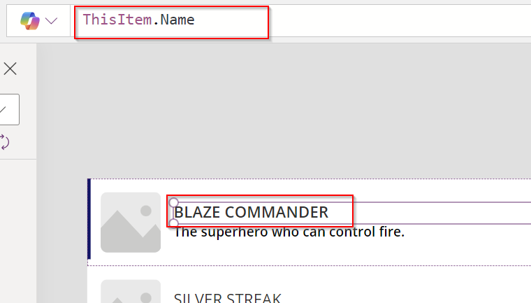
Adding Additional Data Elements to Your Gallery
- Select an Element in the Gallery:
- Click on any element within your Vertical Gallery. This action will bring up the formula bar at the top, showing you the Power Fx associated with that element. You’ll notice it uses the syntax
ThisItemto refer to the current item in the gallery. For example, if you clicked on a label showing the superhero’s name, it might displayThisItem.Name.
- Click on any element within your Vertical Gallery. This action will bring up the formula bar at the top, showing you the Power Fx associated with that element. You’ll notice it uses the syntax
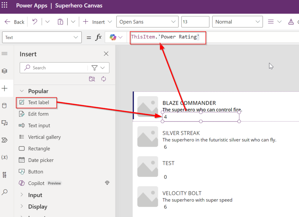
- Add a New Label for Power Rating:
- From the “Insert” tab, drag a new Text label into your gallery. Place this label where you want the Power Rating to appear relative to other elements like the superhero’s name.
- Set the Power Fx for the New Label:
- Click on the newly added label to select it. In the formula bar at the top, replace the existing formula with
ThisItem.'Power Rating'. Make sure to use the exact field name as it appears in your data source, including correct capitalization and spaces. If ‘Power Rating’ is the field name, ensure it’s enclosed in single quotes if it contains spaces.
- Click on the newly added label to select it. In the formula bar at the top, replace the existing formula with
- Customize the Display:
- After setting the formula, the label will automatically update to show the Power Rating for each superhero in the gallery. You can further customize the font size, color, and alignment of the label to make it fit well with the rest of your gallery’s design.
- Preview and Adjust:
- Preview your app to see how the gallery behaves with the added information. Make any necessary adjustments to ensure that all information is clearly visible and the layout looks balanced.
By following these steps, you’ve effectively enhanced your gallery by adding a dynamic element that displays the Power Rating for each superhero. This customization not only makes the gallery more informative but also improves the overall user experience by providing more detailed data at a glance.
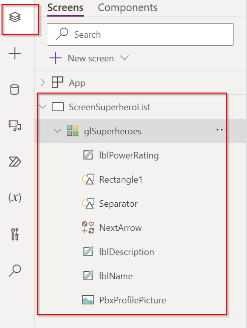
Renaming Controls for Better Clarity and Management
- Select the Control:
- Click on the control you want to rename. This could be any element like a label, button, or gallery within your app.
- Access Control Properties:
- With the control selected, find the control’s name at the top of the properties pane or directly in the formula bar. It typically defaults to a generic name like
Label1orGallery1.
- With the control selected, find the control’s name at the top of the properties pane or directly in the formula bar. It typically defaults to a generic name like
- Rename the Control:
- Click on the name field and type a new, descriptive name that reflects the control’s function. For instance, if a label displays a superhero’s name, you might rename it to
lblSuperheroName. For a gallery displaying superheroes, considergalSuperheroes.
- Click on the name field and type a new, descriptive name that reflects the control’s function. For instance, if a label displays a superhero’s name, you might rename it to
- Consistency and Conventions:
- Aim for consistency in naming conventions across your app. Use prefixes like
btnfor buttons,lblfor labels, andgalfor galleries. This makes it easier to identify control types at a glance, especially in more complex apps with numerous elements.
- Aim for consistency in naming conventions across your app. Use prefixes like
- Apply Changes:
- After renaming, press Enter or click away to apply the changes. The new name should now be reflected throughout your app.
Why Rename Controls?
Renaming controls not only helps in organizing your app’s elements but also enhances readability when writing or reviewing formulas. It simplifies troubleshooting and collaborating with others by making the app structure intuitive and transparent.
By following these steps, you ensure that your Canvas app remains organized and easy to navigate as it evolves, thereby improving both development efficiency and maintenance.
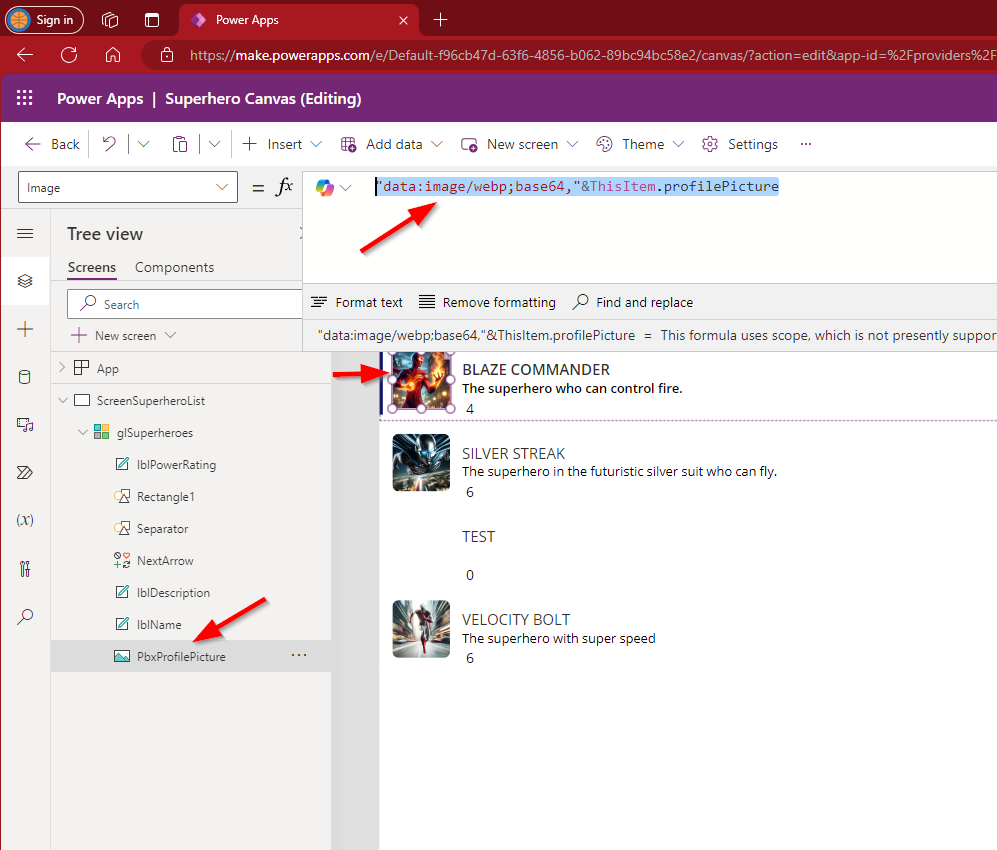
Our gallery in the Canvas app is set up to display images, a feature that enhances user interaction by adding a visual dimension. To facilitate this, I’ve modified the Superhero API page in Business Central to return profile pictures as Base64 encoded strings. This update allows us to directly embed the images into our app.
Integrating Images into the Gallery:
To display these images within the gallery:
- Update API Page: First, ensure that your Business Central API page is configured to output the profile pictures as Base64 encoded strings. This encoding is necessary to transmit the image data over the web efficiently.
- Set Image Control Source: In the Canvas app, set the source property of the image control within the gallery. Use the formula
"data:image/webp;base64," & ThisItem.profilePicture. This formula constructs the correct format for displaying Base64 encoded images in web applications:data:image/webp;base64,is a prefix that specifies the format and encoding type, indicating that the following string is a Base64 encoded WEBP image.& ThisItem.profilePictureappends the actual Base64 encoded string from the current item in the gallery (i.e., the profile picture data).
By applying this configuration, each profile picture stored in Business Central will be displayed in the gallery of your Canvas app, making the interface more engaging and informative. This method leverages the flexibility of Canvas apps to handle diverse data types and sources, showcasing the robust integration capabilities of Power Apps.
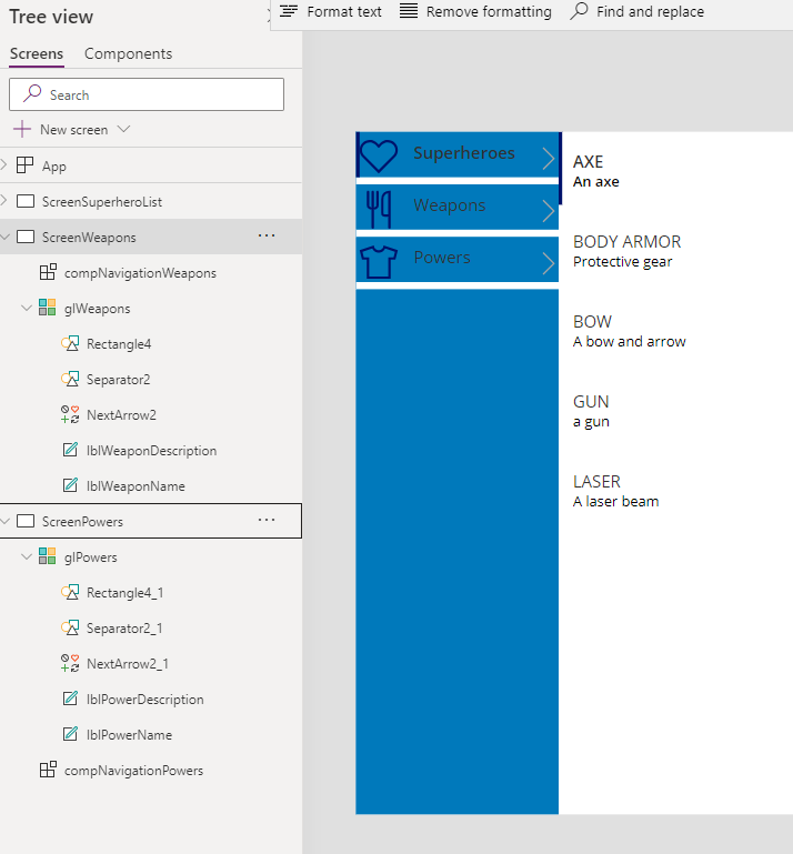
Creating a Custom Navigation Menu in a Canvas App
Unlike Model-Driven apps, which provide a predefined navigation structure, Canvas apps require you to manually create your own navigation menu. This approach demands more effort but offers significant flexibility, allowing you to tailor the navigation to fit the specific needs and style of your app.
Designing Your Navigation Menu:
- Choose a Style: In Canvas apps, you have the freedom to design the navigation menu in various styles. Whether you prefer a tabbed navigation at the top, a hamburger dropdown menu, or a sidebar menu, the choice depends entirely on your app’s design requirements and your personal preference.
- Implementing a Classic Sidebar Menu: For simplicity and ease of use, especially if you’re not focused on complex design, a classic sidebar menu is an excellent choice. This type of menu is straightforward to implement and navigate, making it ideal for both new and seasoned users.
Creating a Reusable Navigation Menu Component
To enhance the usability and maintainability of our Canvas app, we will create a navigation menu as a component. Components in PowerApps are reusable across multiple screens, which significantly simplifies updates and modifications, such as adding new menu items later on.
Steps to Create a Navigation Menu Component:
To build our simple navigation menu, we’ll use a Component because of its reusability across multiple screens. This approach allows for easier updates, such as adding new menu items later, without the need to modify each screen individually. To get started, navigate to the “Components” tab in your app development environment. From there, create a new component. I’ll name this component “compNavigation” for clarity and ease of reference in future steps. This method ensures that any changes or additions to the navigation menu can be handled efficiently in one central place.
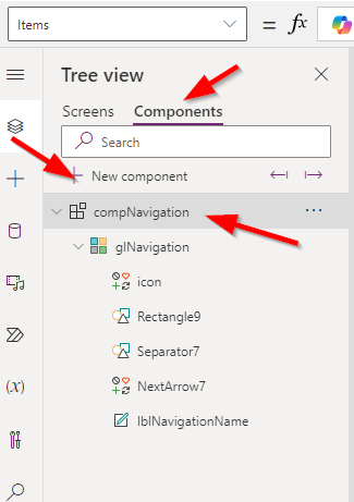
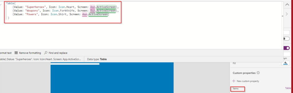
Inside my component, I’ve incorporated a Gallery that includes both an Icon and a Label for each item. To enhance the gallery’s functionality and make it adaptable for different parts of the app, I’ve added a new custom property. This property is of type ‘table’ and is designed to outline the navigation structure. Here’s the table structure I used:
- Superheroes: Represented by an Icon.Heart, linking to the currently active screen.
- Weapons: Represented by an Icon.ForkKnife, also linking to the currently active screen.
- Powers: Represented by an Icon.Shirt, linking to the active screen as well.
This configuration allows for straightforward navigation updates across the app by simply modifying the component’s table data, ensuring that each part of the app is easily accessible through the component’s gallery.

Matthew Devaney has created a very great post that details how to create a Custom component which I would encourage you to take a look at https://www.matthewdevaney.com/power-apps-navigation-menu-component/
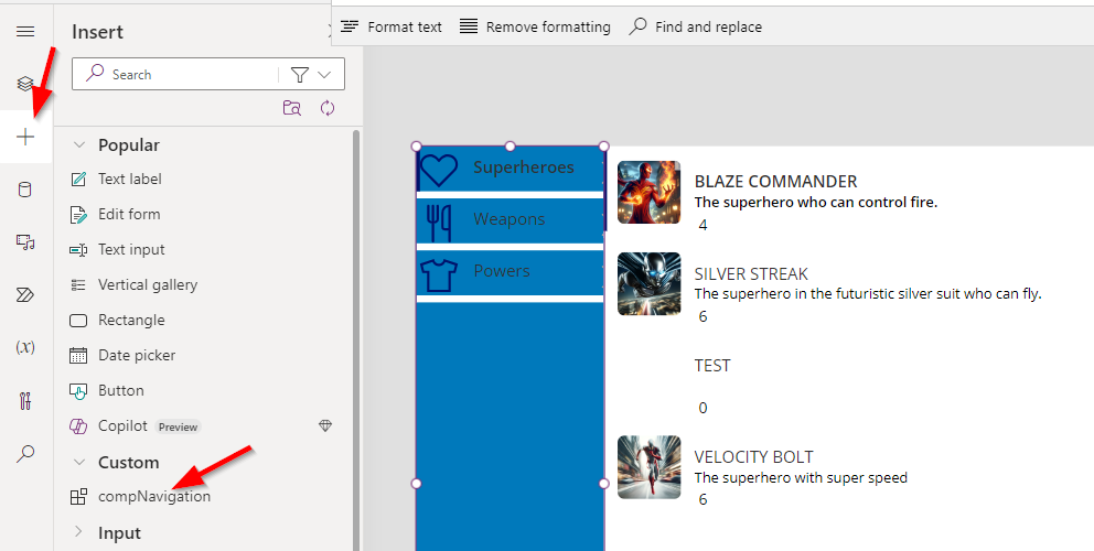
Now that our custom navigation component is ready, we can add it to our screen for seamless navigation throughout the app. Simply go to the “Insert” tab, find the “Custom” group, and look for your newly created component, labeled as “compNavigation.” Drag this component onto your screen wherever you want the navigation menu to appear. This integration allows for consistent navigation functionality across different parts of your app.
To maintain consistency across your app, you’ve successfully used the same method previously applied to create ScreenSuperheroList for creating additional screens, specifically ScreenWeapons and ScreenPowers. This approach ensures uniformity in the design and functionality of your screens, facilitating a cohesive user experience as users navigate through the different sections of your app.
To effectively integrate our screens with the navigation menu, we’ll utilize the OnStart property of our app to define the navigation structure. This involves creating a collection named colSidebarMenu that includes details for each screen accessible via the navigation component. Here’s the code to add to the OnStart event:
plaintextCopy codeSet(colSidebarMenu, Table(
    {Value: "Superheroes", Icon: Icon.Heart, Screen: ScreenSuperheroList},
    {Value: "Weapons", Icon: Icon.ForkKnife, Screen: ScreenWeapons},
    {Value: "Powers", Icon: Icon.Shirt, Screen: ScreenPowers}
))
This code snippet sets up a table within a collection, outlining the navigation links for the Superheroes, Weapons, and Powers sections of the app. Each item in the table specifies the display name, icon, and associated screen.
Note: Unlike the initial setup within the component where we used a direct table, here we are populating a collection that the navigation component, CompNavigation, will reference in its Items property.
Important Step After Implementation: After adding this code to the OnStart, ensure you save your app and restart it. This is necessary because the collection colSidebarMenu is populated at the start of the app. Restarting the app is required to populate the collection and update your navigation menu with the new items. This ensures that when the app launches, your navigation component will reflect the most recent changes and function correctly.
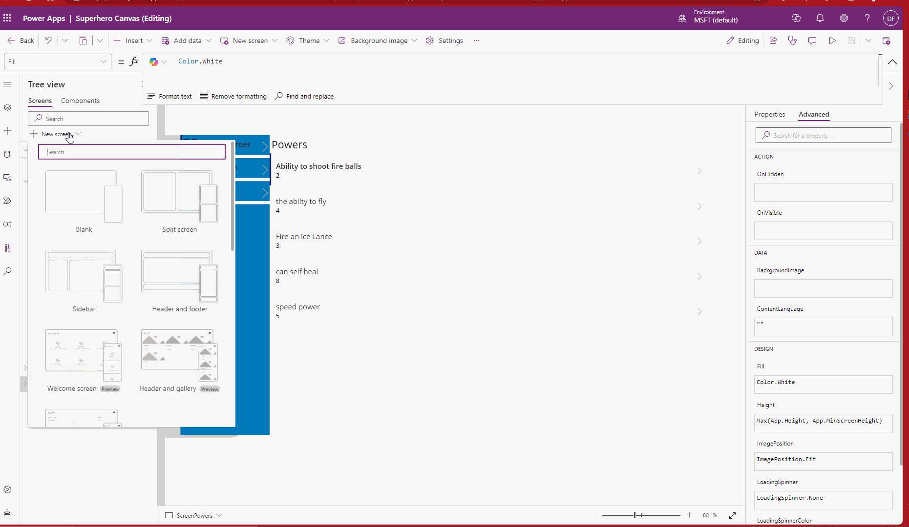
To create a detailed view for each superhero, start by setting up a new screen named ScreenSuperhero. This screen will display detailed information about the superhero selected from the gallery.
Configuring Navigation and Data Passing:
- Create a New Screen:
- Add a new screen to your Canvas app and name it
ScreenSuperhero. This screen will serve as the detailed page for displaying individual superhero data.
- Add a new screen to your Canvas app and name it
- Set Up Item Selection:
- Navigate to the gallery that lists the superheroes, identified by
glSuperheroes. - In the
OnSelectproperty of the gallery (or the specific item within the gallery), add the following PowerApps formula:
- Navigate to the gallery that lists the superheroes, identified by
plaintextCopy codeSet(varSelectedSuperhero, ThisItem);
Navigate(ScreenSuperhero);
This code performs two key functions:
- Set Variable: It assigns the superhero item that the user selects from the gallery to a variable called
varSelectedSuperhero. This variable holds all the data of the selected item, making it accessible across the app. - Navigate: It then uses the
Navigatefunction to transition the user toScreenSuperhero, where you can design the layout to display the details of the superhero stored invarSelectedSuperhero.
Next, let’s enhance the functionality of our ScreenSuperhero. First, we need to add our CompNavigation component to ensure consistent navigation across the app. Then, proceed to add a Label that will display the name of our superhero. Set the label’s value to varSelectedSuperhero.Name, which holds the name of the superhero selected from our gallery.
Following that, add another label with the text “Description” alongside a text input box. Link this text box to varSelectedSuperhero.Description to show and allow editing of the superhero’s description.
Lastly, include a button on this screen that will be used to update the superhero’s description. Assign the following code to the button’s OnSelect property:
plaintextCopy codePatch(Superheroes, LookUp(Superheroes, Name = varSelectedSuperhero.Name), {Description: txtSuperheroDescription.Text, Name: varSelectedSuperhero.Name});
This formula uses the Patch function to update the record in our Dataverse. It locates the correct record using a LookUp that matches the superhero’s name, and then updates the Description field with the value entered in the text input box, alongside confirming the superhero’s name as part of the JSON payload. This ensures that any changes made in the input box are saved back to the database when the button is pressed.
A useful tip for testing your Canvas app in the Power Apps editor is to utilize the ALT key to simulate user interactions. Specifically, you can use the gallery on ScreenSuperheroList to navigate to ScreenSuperhero and test the data passing functionality. Simply hold down the ALT key and click on an item within the gallery. This action will trigger any OnSelect events associated with the gallery items, such as navigating to another screen and passing data to it. Holding the ALT key allows you to interact with your app in preview mode directly within the editor, making it a handy tool for rapid testing and debugging.
It’s time to wrap up this post, as it has become quite extensive. While it’s impossible to cover all aspects of Canvas apps in a single entry, the aim here was to get you started and showcase the flexibility that integrating Business Central with Canvas apps offers. To conclude, I’ll leave you with a note on how Power Automate can be utilized within our Canvas apps to interact with Business Central API endpoints or any other HTTP endpoints, further enhancing the app’s functionality.
To integrate Power Automate into your Canvas app, navigate to the “Power Automate” menu and select the “Create” action. This process allows you to set up a new flow tailored to your app’s needs. Crucially, you can define inputs for your flow, which act as parameters sent from your Canvas app to the flow. Additionally, make sure to configure a “Respond to Power App or flow” action within your flow. This step is essential as it enables your flow to send return values back to your Canvas app, facilitating dynamic data interactions based on user input or other app activities.
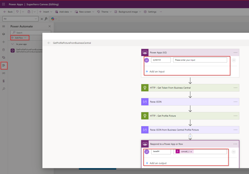
You can trigger the Power Automate flow in your Canvas app using various actions, such as a button’s OnSelect. To call the Power Automate flow and handle its response, use the following Power Fx:
plaintextCopy codeSet(TextOutput, GetProfilePictureFromBusinessCentral.Run(varSelectedSuperhero.'System ID').base64);
Notify(TextOutput);
This code sets the TextOutput variable to the result of the GetProfilePictureFromBusinessCentral flow, which fetches a base64 encoded image based on the selected superhero’s System ID. It then notifies the user with the output.
Concluding Thoughts
Canvas apps offer a high degree of customization and control, allowing you to tailor nearly every aspect of your app. However, this flexibility comes with increased complexity in both development and maintenance. Always consider the balance between the flexibility you need and the resources—time and money—you are willing to invest. Canvas apps can be powerful tools, but they require thoughtful planning and execution.